Thursday, September 26, 2013

in the money

Wait. What? I haven't blogged since LAST NOVEMBER?? I have a simple excuse: I had a baby. Our special delivery has made for lots of excitement around our house—especially since we already had a toddler in tow! But all those stories are for another blog...

Have you seen the new $100 bill? Well, I know you haven't physically seen it (since it's not quite in circulation yet) but here's a sneak peek.

source: NewMoney.gov

The new bill boasts all kinds of changes not the least of which is more color. Along with color, there is also more texture on Ben Franklin's imprint as well as other random places on the bill. As you can see there is a vertical, blue ribbon running up and down the bill; it's three dimensional and placed there for security purposes. Other new additions include the following:

— Text from the Declaration of Independence printed in script next to Benjamin Franklin's portrait.
— A copper-colored ink well in which the ink changes to green when the bill is shifted.
— A gold "100" stamped on the back of the bill to help the visually impaired.
 This has been a long-time coming as these changes have been undergoing many production-related delays. But stay tuned—you could see this new note as early as next month.  _______________________________________________________ Here's the full news story if you're interested

New $100 Bill Has Ink Well, More Color, 3-D

A glitzier, high-tech version of America's $100 bill is rolling off the presses and headed for wallets soon.
 
Despite years of production-related delays, the updated $100 bill has undergone a major makeover that includes a color-changing ink well, 3-D security ribbon, and more texture on Benjamin Franklin's collar.
 
The new, more expensive C-note is scheduled to enter circulation Oct. 8 and also has a higher calling: It aims to fight back against counterfeiters by using better printers and technology.
 
The modifications will help people check for fake $100s without going to a bank or using a blacklight, said Michael Lambert, a deputy associate director at the Federal Reserve.
 
"We try and find security features that can be used at a number of different levels, from more experienced cash handlers ... down to the person on the street who really needs to know the security features so they can protect themselves," Lambert said in an interview Wednesday.
 
The new $100 bill still bears the image of Franklin, one of America's Founding Fathers. But it adds part of the Declaration of Independence, written in script from Franklin's left shoulder to the right edge of the bill. A quill and an ink well are printed behind the text, and a blue ribbon goes down near the center of the bill.
 
The ink in the well changes colors from copper to green when the bill is turned. A watermark of Franklin also appears on the right side of the bill when it's held up to light.
 
The Federal Reserve said in its latest currency budget that it would order 2.5 billion new $100 bills this year. Lambert estimated each new bill costs about 4 cents more to print than the old one, totaling an additional $100 million in costs this year.
 
The Fed also budgeted about $9.5 million this year for its education program, which includes global outreach efforts about the new note.
 
The government has redesigned the $5, $10, $20 and $50 bills during the last decade to add security features. The $1 remains the only bill not to get a makeover.
 
At a federal facility in Fort Worth, 32-bill sheets of money paper are printed, stamped with serial numbers and sliced into individual notes. The notes are sorted into piles 100 deep, banded together and eventually stacked into 4,000-note bricks worth $400,000. Those bricks will be shipped to Federal Reserve banks across the United States for distribution.
 
A multi-step printing process leaves the bills with their distinctive colors and texture. The process takes place under tight security inside a secluded facility several miles north of downtown Fort Worth. Several checkpoints stand between the facility's gated entrance and the printing floor, where dozens of overhead security cameras watch the process.
———
Noel Waghorn of Associated Press Television News contributed to this report from Washington.
Follow Nomaan Merchant on Twitter at http://www.twitter.com/nomaanmerchant

Read more here: http://www.kansas.com/2013/09/25/3021100/a-glance-at-americas-new-100-bill.html#storylink=cpy

Wednesday, November 28, 2012

personalize it

I happened across a new site with special sales and what to my wondering eyes should appear but one of my first loves: typography! Combined with the personalization....and the idea for Christmas gifts...unique...made in the U.S.A....the list goes on and on. See for yourself:


photos courtesy: AntiqueFarmHouse.com


See what I mean?

Check out Jami Clune's blog: Freckled Laundry | DIY vintage chic or if you're like me and your wheels are turning with ideas for gifts, visit the Antique Farm House to purchase some clay tags of your own. But do it soon...I'm not sure how long their deals last and know the individual tags are already sold out.

Joy!

Sunday, November 11, 2012

much ado about...not much

On Thursday there were a bunch of suits that gathered at Cowboys Stadium in Arlington, Texas. Among those were the Big 12 Commissioner Bob Bowlsby, Dallas Cowboys Executive Vice President and Vice President of Brand Management Charlotte Jones Anderson, and Xavier Director of Athletics Mike Bobinski (Chair of the Division I NCAA Men's Basketball Committee).

On the agenda: the reveal of the 2014 NCAA Final Four logo.

With it being only the seventh Final Four played in Texas (second in the North Texas region and after a nearly 30 year hiatus), obviously the Big 12 along with close by fans in the Midwest are happy with the news. Said Bobinski: “As we kick off the next 75 years of March Madness, Cowboys Stadium will get to host its first Final Four.”

Yes. I, too, am thrilled with the news of a venue that certainly feels more like home. But that's not what this blog is about....it's about design. Duh. So here it is...the logo.


courtesy: Big12Sports.com

What do you think? Love it? Hate it? Or are you lukewarm like me? The bevels, embossing, and metallic effects of the 'Final Four' are really quite nice. And that's about all I have to say about that. I was very much looking forward to the unveiling but to say the results were disappointing is an understatement.


courtesy: @Big12Conference [twitter]

I am much more impressed with this photo that @Big12Conference tweeted! Of course, who wouldn't be impressed with a 160 foot video screen?

____________

And for those of you basketball fans out there: you can apply for tickets to the 2014 Men's Final Four through the NCAA's random selection process March 18 - May 31, 2013. Visit www.NCAA.com for more details.

Cowboys Stadium is also the site for the 2013 South Regional, which takes place March 29 and 31. Tickets to those Sweet 16 and Elite 8 games are available by visiting www.NCAA.com/mbbtickets.

Friday, November 2, 2012

attention Kansas drivers

Are you heading to the DMV? If so, I wish you short lines, helpful and friendly employees, and a photo that resembles more of you, less of the haunting-form-of-self that you wouldn't recognize even on a bad day.

Even if all the above wishes were to come true, there is yet another thing that would be new to this visit—the overall design of the license itself.


BEFORE
Courtesy Kansas Department of Revenue


AFTER
Courtesy Kansas Department of Revenue


The new license design boasts numerous security measures which make it even harder for fakes to be produced. According to a news release from Fox 4 News KC, those updates include:        
  • Ultra-violet image of the cardholder’s portrait and date of birth on the back of the card (viewable with UV light)
  • Multi-colored, highly detailed holograms
  • Highly detailed ultra-violet (UV) image of the state flower (viewable with UV light)
  • Two ghost images of the cardholder’s portrait in addition to the conventional photograph
  • Tactile printing that you can feel
You had me at tactile printing!

As mentioned before, Kansas’ driver’s license and ID card design was last changed in 2004; states typically change their designs every four to six years.

"The new Kansas driver’s license card is among the most secure in the country," said Alcoholic Beverage Control Director Dean Reynoldson, who also oversees the department’s Office of Special Investigations, which investigates driver’s license fraud. "The card, combined with a new more secure driver’s license and ID card application process, makes Kansas one of the most difficult states to commit driver’s license or identification card fraud."

One thing hasn't changed—the format for printing cards for drivers who are under 21 years of age. Those licenses will remain in a vertical format so it's easier to tell if the cardholder is of a legal drinking age or not.


the 'under 21' license
Courtesy Kansas Department of Revenue


Wednesday, October 31, 2012

pumpkin type

Freshly Carved Pumpkin Typeface

by Jessica Kuhn for How Magazine Blog

One Kentucky-based advertising and branding agency combined their flair for creativity and love of Halloween to create a typeface carved from pumpkins. Intrinzic, the firm that brought this ghoulish typeface to life, carved each letter and character from slabs of ripe pumpkins, which were gathered from a family farm in the rolling hills of Kentucky.

In a true collaborative fashion, each employee created a letter of the alphabet for what they call Pumpkin Face. Check out the results below!


Read more: Freshly Carved Pumpkin Typeface | HOW Magazine Blog http://blog.howdesign.com/typography/pumpkin-typeface/#ixzz2Au0lBrk6

Thursday, October 18, 2012

looking back

This Dutch windmill in Lawrence, Kansas was photographed between the years of 1890 and 1899.


This is a cyanotype showing the old Dutch windmill, which stood on west Ninth Street in Lawrence, Kansas. Construction on the windmill started July 1, 1863 by A. Plum and G. H. Wilder. Fourteen men were brought from Sweden by Plum to build the windmill. It was destroyed in Quantrill's Raid and rebuilt in 1864.

It was octagon shaped, four stories in height, and the basement had walls of stone six feet thick. The mill had four millstones, two for wheat and two for corn. The capacity of the mill was twenty bushels daily each of flour and meal. With the wind blowing at the rate of twenty-five miles an hour the mill would have eighty horse power. The mill ceased running in July 1885 and a fire destroyed it in 1905.

photo courtesy of  Kansas Historical Society
Item Number: 227455 Call Number: FK2.D4 L.7 *23
KSHS Identifier: DaRT ID: 227455

Wednesday, October 17, 2012

hold on tight, Kansas

According to the Associated Press, Kansas driver's licenses are about to get a new look and some new features.


The Department of Revenue is unveiling the new design at an event Tuesday with Governor Sam Brownback and Revenue Secretary Nick Jordan.

Motorists will begin receiving the new licenses this week. Among the elements are new security features to protect against identity theft or illegal duplication.

Revenue Department spokeswoman Jeannine Koranda says Kansas updates its driver's licenses every four to six years as technology changes.

Stay tuned for the results...

Wednesday, October 3, 2012

colorful San Antonio

Thanks so much to everyone who participated via Facebook, twitter, or blogger direct. The location of the photos that I shared in where in the USA? and where in the USA? more hints was San Antonio, Texas. What a beautifully, colorful city.

Congratulations to Amanda Eilders & Amy
for correctly guessing the location!


Here are a few more favorites that didn't get posted for fear of spoiling the game completely.

Mi tierra Cafe & Bakery


Quarry Market


What's a San Antonio post without a mention of the River Walk?


I plan to share more photos along the way and hopefully I'll get even more people to participate.

Thursday, September 27, 2012

where in the USA? more hints

So not a single person has guessed the location of previously posted photos/game. Which got me thinking: maybe I made it too hard. Here are a few more pictures from the same location that might help get your guesses coming...


so this definitely narrows down the selection of U.S. cities

too much information?

I feel like I'm giving it away now for sure.

...that's assuming that people are actually reading this. Am I the only one having fun with this game?

Tuesday, September 25, 2012

where in the USA?

Let's play a game.

I apologize for those of you who hate games but to be honest, I just want to get a little dialogue going and to get a feel for my audience (or if no one at all is reading). So here's how to play: I'll show you some photos and you guess where in the USA the photos were taken by leaving a comment below. Then check back next week for results.


Guess the city, give your feedback on the photos, let me know if the photos make it too easy or too hard, tell me what you want to see from this blog.

I look forward to hearing from you. Someone, please.

Monday, September 24, 2012

honey

I've been on hiatus but I'm back now.


Thanks for checking in.

Wednesday, April 25, 2012

new colors!


Pantone has added 336 brand new colours to its Pantone Plus series, giving designers more choice and flexibility when it comes to creative work

The 336 new colours - which range from pale pastels to intense deep tones - bring the total number of hue variations in the Pantone Plus series to 1,677 in both coated and uncoated formats. Pantone Plus is the relatively new name for the 50-year-old Pantone Matching System, which, was extensively revamped in March 2010.

Pantone says the new colours were inspired by the Pantone Goe System, which brings new ink combinations and depth to its colour library. “The Goe System represents important technical improvements in the area of ink film consistency and coatability and these benefits have migrated to the 336 New Colours,” Pantone said in a press statement. “Formulated for consistent ink-film thickness, the 336 New Colours can be easily reproduced by printers worldwide.”


Pantone guide updates

To help designers and other creative pros discover and use the new colours, Pantone is updated its range of colour guides, both as standalone volumes and as supplements to existing guides. It’s also rolling out updated versions of its Pantone Colour Manager Software (May 4th) and myPantone iPhone and Android apps (early June). The company’s Capsure system will be updated with the new colours by the end of May.

__________________________________________________

source: Robert Mead-Green  |  As Computer Arts' deputy editor, Robert writes, commissions and edits a whole bunch of content for the magazine, ranging from cover features and studio profiles to tutorials and our 16-page Manual section. He's also a frequent contributor to the Computer Arts blog. When he's not doing his day job he also writes for several other Future Publishing titles including MacFormat and Tap. In the little spare time Rob has left he tries sleeping, toying with his Mac and iPhone or playing Harry Potter and the Peppa Pig Pirates of the Star Wars Caribbean with his kids.

Tuesday, December 6, 2011

do you follow?

This is a book review of sorts. The book:


[It] was the most popular book amongst Brain Pickings readers this year — a delightful pocket-sized compendium of flowcharts and lists to help you figure out life’s big answers by ever-inventive designer Stefan G. Bucher, he of You Deserve a Medal and Daily Monster fame.

Besides Bucher’s own questions, the tiny but potent handbook features contributions from 36 beloved creators across various disciplines, including Brain Pickings favorites Christoph Niemann, Stefan Sagmeister, Marian Bantjes, Doyald Young, and Jakob Trollbäck.

Check out what lies within.


Let’s be clear: I want this book to be useful to you. There are many great how-to books and biographies out there, and even more gorgeous collections of current and classic work to awe and inspire. But looking at catalogs of artistic success won’t make you a better artist any more than looking at photos of healthy people will cure your cold. You’ve got to take action!”

—Stefan G. Bucher


“If you keep this book in mint condition, I’ve failed,” says Bucher.


We are all different people, but we face a lot of the same questions. The point of this book is to give you lots of questions you can use to look at your life — in a new way, with a different perspective, or maybe just in more detail than you have before — so you can find out how you work, what you want to do, and how you can get it done in a way that works for you. Specifically.”

—Stefan G. Bucher


[source: ]

Page images copyright © 2012. Pearson Education, Inc. and New Riders
Note: you can click on the images for a larger view.

Tuesday, November 29, 2011

photography

Photography is a true passion of mine. That said, hours spent devouring an issue of National Geographic is never time 'lost.' The National Geographic photo contest is upon us...the deadline for entries for this year's is November 30.

Photographers of all skill levels (last year more than 16,000 images submitted by photographers from 130 countries) enter photographs in three categories: Nature, People and Places. The photographs are judged on creativity and photographic quality by a panel of experts. There is one first place winner in each category and a grand prize winner as well. Follow this link to see 54 amazing moments as selected from each of the 3 categories. Here are a few of my favorites..


LONE TREE YELLOWSTONE: A solitary tree surviving another harsh winter in Yellowstone National Park. Yellowstone National Park, Wyoming.
(Photo and caption by Anita Erdmann/Nature/National Geographic Photo Contest)


IS HE STILL THERE?!: One morning while on the Big Island of Hawaii, i exploring my surroundings to see if i could find something to photograph. I almost went back inside when something on this huge palm tree leaf caught my eye. I stayed around and it was this little gecko, startled by my presence he was hidden between the ridges of the leaf. He would pop his head up periodically to check his surroundings, as soon as he saw i was still there he would hide again. We played this game for a while until i got the shot. Holualoa big Island, Hawaii.
(Photo and caption by Lorenzo Menendez/Nature/National Geographic Photo Contest)


FLESH AND BONES: In a world where no one understands the importance of nature, all that is left of our nature is just these flesh & bones. Toronto, Canada.
(Photo and caption by Amirhassan Farokhpour/Nature/National Geographic Photo Contest)
 

LOVE OF PARENTS: The emperor penguins fight for survival and to protect their only baby in the frozen Antarctic ice desert. Antarctica: Atka Bay, Weddell Sea.
(Photo and caption by Claus Possberg/National Geographic Photo Contest)


MY OWN LIGHT: Pinki Kundu, a 13 yrs old girl is suffering from a chronic disease & is being treated in Mother Teresa TB Hospital in Kolkata.She is under CAT 1 drug therapy & is doing well.The day I photographed her she was very hopeful mood that she would be returning back to her parent soon. Kolkata, West Bengal, India.
(Photo and caption by Saibal Gupta/People/National Geographic Photo Contest)

______________________________________________________


Photo 47 never did load on my computer...did you see it?

Which photo(s) was your favorite?

Monday, November 14, 2011

professor refuses to teach if students don't bring snacks

USA Today featured this story in their education section today as provided by Scott Jaschik, Inside Higher Ed. Check it out:

Students in George Parrott's psychology courses have an unusual requirement: they must bring homemade snacks each week to the laboratory section, and they need to work out a schedule such that groups of students make sure each session is covered, and that snacks aren't repeated from week to week. If there are no snacks, Parrott walks out of his class at California State University at Sacramento, and the students lose that week's instruction.
 
Parrott has been teaching at the university since 1969. He says he started this requirement a few years after he arrived — and that most students have appreciated the ideas behind the rule (which he says are more educational than culinary). But on Thursday, when students in the morning section of Foundations of Behavioral Research didn't bring muffins (or anything), he enforced his rule. He left class and took his teaching assistant to breakfast. One of the other sections missed its snack obligation one day last month, and he left that class, too. Ever since, the snack schedule has been followed by the students in that class.

This is Parrott's last semester before retirement, but his teaching technique — in use for more than 30 years — is now being subjected to scrutiny. Some of the students in the section he didn't teach on Thursday complained, and the university is now investigating.

Joseph Sheley, the provost at Sacramento State, said via e-mail that the university wants to be sure of the facts, and plans an inquiry this week. But he also said that he would "ask the psychology department to review whether or not the practice is appropriate within the department's curricular and learning outcome goals."
In an interview with Inside Higher Ed, Parrott defended his teaching methods. He said he could understand why some students would be frustrated about the missed class time, but that people should view his requirement as a valid pedagogical choice.

A graduate of Cal State's Chico campus, Parrott said that when he was an undergraduate, courses had 12 to 20 students, and those in a class formed close ties among themselves and with the professor. "Those days are long gone," Parrott said. The course in question is supposed to have a maximum of 42 students, although this year he has 52 in the section that skipped snack last week. That makes it hard for students to connect. So does the nature of Sacramento State's student body. "It's a commuter rat race. Students drive in and go home and never connect with their fellow students," he said.

Enter the snack requirement: Parrott said that he's teaching students to work together to set a schedule, to work in teams to get something done, and to check up on one another, since everyone depends on whoever has the duty of bringing snacks on a given week. Typically, no individual should be involved in preparing the snack more than twice a semester, he said.

Parrott said that considerable research shows that students learn more if they develop the skills to work in teams, to assume responsibility for projects, and get to know their fellow students. Team members need to count on one another, he said, and his students learned Thursday that if someone fails at a task for the team, there are consequences. "They need to learn to check on one another and clearly they didn't get that done," he said. "This was an important lesson."

There are some practical considerations for the requirement as well. Lab sessions run three hours, so some people get hungry. And the snacks, he said, make the classes slightly less formal and thus promote closer ties between instructor and students. As for the requirement that the snacks be homemade, he said that he wants the snacks to be healthy. "I'd like stuff without the total chemical treatment" that is found in packaged snacks, he said. He added that he rarely eats the snacks, but wants them there for everyone else.

People typically bring muffins, cookies or coffee cake to morning sessions, Parrott said. One of his afternoon sections recently featured pizza.

Alexander C. McCormick is director of the National Survey of Student Engagement, which has found positive impacts on students from working together, and working on projects outside of class. He said he would be hesitant to say too much without knowing all the details of the discussion at Sacramento State. But he said that the snack requirement may help to "build connections and community among students — especially challenging when most students are commuters." Further, he said that such a requirement "can also help reinforce skills like collaboration, organization, planning, etc."

McCormick said that "it's good to help students recognize they share responsibility for a successful class, though I think this is both more clear and more powerful when connected to the subject matter." For instance, he said, students might gain more by preparing or maintaining lab equipment or by discussing projects and writing them up together than by preparing a snack.

And McCormick also mentioned concerns about the sanction of the professor leaving class. "When the professor doesn't teach because someone didn't bring a snack, who gets blamed and what are the consequences for connections among students?," he asked. "Is it right to deprive all students of the class when one or a group fail to or are unable to prepare and bring a snack? That's certainly arguable. It also seems to empower one student who may not care much about the class."

Although Parrott said he is convinced that his students gain from his technique — even when he walks away from class — he said he couldn't think of another faculty member who shares his approach. He plans to stick to his rule for his last semester. Given that he is on track to retire, he said that if told to stop enforcing the rule, "I'd probably ignore it."
So what do you think? Is Parrott out of line? Do you think his teaching method is a good one? Why or why not?

Friday, November 11, 2011

photoshop tricks & tips

I got this article from a tutorial by Stéphanie Walter. Check out what she had to share:


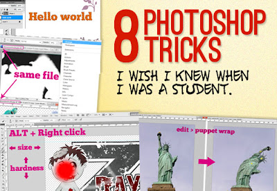
Photoshop is one of the (if not THE) most well known software used in the design industry when it comes to manipulating images and pixels. As a web designer I had some Photoshop lessons at school but that was 2 years ago. Today the software has evolved, more options are available, and I also learn a few tricks while practicing.

You will find in this article eight tricks I wish I knew when I was a student (or wish existed in previous Photoshop versions). These are the kind of tricks that could make your workflow faster and your life easier.


-1- Easier Illustrator-like Layer Auto-Select

As I do a lot of logo / UI design, I won’t hide it, I’m a huge fan of Illustrator. One of the things I like the most when working with illustrator is the fact that whenever you select something, you can see the actual selection on the working space. You can also click on whatever you want to edit, and it will be selected.

In Photoshop by default you have to go and select what you want to work on in the layer panel, and use a CTRL + click on the element to select it, or right-click somewhere in the working space and you’ll get a list of your layers (good luck if you did not rename them).


Fortunately, there’s a simple tip to make Photoshop behave like illustrator. When you select the Move Tool (V key) you will see in the option bar a check box "auto-select" and a drop down list next to it. Check the box, and put layer in the drop down list. Know, whenever you click on an element that was not locked, it is selected in your layers panel.

You can also check the "show transform controls" if you want to see some transform controls around your elements and be able to resize them directly, Illustrator style.

Bonus point: you can select multiple layers by drawing a rectangle around them like in illustrator (still using move tool and not marquee tool).


-2- Get Better & Quicker Control on Your Current Tool Size

Usually to change the size of a tool, you can either use the drop-down list in the options bar, or right click in the middle of the document that will open a pop-up. But did you know that you could change the size of the tool you are working with, in a far more precise way by only using your mouse and the ALT key?


The technique is pretty simple. FIRST hold ALT key and THEN right click on the mouse, you then will see a red circle appear. This is the current tool size. Move your mouse to the right: the size of the tool gets bigger, move it to the left: the tool gets smaller.

Bonus point: If you move it to the top and the tool hardness will decrease, move it to the bottom, and the tool hardness will increase. This trick works with all the tools that can get a specific size and hardness.


-3- Take Advantage of Multiple Windows

If you go and take a look in the windows menu, you will see under 'Arrange' the option "new windows for ZZZ". This option will duplicate your current document in a new window. The nice part about this is that changes will affect both windows, it is basically just a second view of the same document.

Then you’ll ask, why would I want to open the same document in two windows? I’ll give you two examples for using this tip.

Let’s say that you are working on a document that will be both used for web AND print, you might want to have a preview of your document in CMYK right? Here comes the handy part of the trick: you can still work in an RGB environment on your document, while previewing what it will look like in CMYK. Go to window > arrange > new window for XXX. Then set the view of this document to "proof colors" (CTRL+Y).

Now you can keep on working on your document in RGB, while seeing what it would look like for the print version.


Another use would be while working with layer masks. To display a layer mask in full screen option, you just have to press ALT + click on the layer mask. You should then get a layer of black and white colors, corresponding to your layer mask. It is pretty hard to work on that layer, since you don't really see what you are doing.

Here again we could open our document on a new window, and then get side by side the layer mask preview and our image. We could then do more precise work on the layer mask and see results on the other window.


-4- Unleash the Power of Clipping Masks

Clipping masks are very useful in complex Photoshop creations. They enable you to work, using another layer as a frame. Basically, whatever is created in a clipping mask will only affect the layer below it. We can see an example with some text.


In the example below, I created a text layer. Then I added an empty layer, and clipped it to the text. I used a brush to draw pink leaves above the text and as you can see, the brush can't go "outside" of the text layer. If I release my clipping mask, I then see that what I created was actually not cut, just hidden.

To create a clipping mask above a layer, you just have to hold down the ALT key while clicking on the create new layer icon. Then the new layer dial box appears, and you can just check "Use previous layer to create clipping mask". You can also achieve this with the keys shift + CTRL + N.


-5- Easily Create a Selection from a Layer or Mask

By clicking on the thumbnail of a layer and holding down the CTRL key, you will create a selection based on the layer clicked. Once again this can be very useful to select text for example, but also complex shapes.


The great thing about this trick is that it will work on layers, but also on masks. You can for example select the shape of a vector mask.


-6- Puppet Warp Transform

To transform an image using puppet warp transform, simply click on edit > puppet warp. The image will be then scattered with a mosaic of lines. At the junction of each line, you can place a pin. You will need at least two pins on the image.

The active pin is symbolized by a yellow disc with a second black one, inactive pins are simply yellow discs. With puppet warp you can move a part of the image while the other parts don’t move. Just pin the parts of the image you don't want to move, and play with the other ones.

Here is an example of what can be achieved, let's make the Statue of Liberty dance:


Image credit: Mr G's Travels
You can delete a pin by holding ALT and hovering over the pin with the mouse, you can also get a rotating circle around the active pin with this same ALT key.


-7- Use the « Styles » to Save Useful Effect Presets

Another Illustrator feature I really like is the "graphic styles" panel which enables you to save any element style you create. This is particularly useful when you do a lot of GUI design, lots of buttons and you want to be able to re-use a graphical style you created. This feature is also possible in Photoshop.

Once you are finished playing with your drop shadow, inner shadows, etc. options, you can see that there is a tab at the top of the layer style named “styles”. You might never have noticed that, but you can click on it. Then you can simply click on the "New style" button, and save your style.


Another way would be to select the layer that has the style you want to save, open the style panel on the right (you might have to activate it in “view”) and click the little “new” icon (same icon as new layer in fact), then save it.

In this panel, you can also see all the other styles that were saved (or default Photoshop ugly styles). To apply a style to an element, first select the layer. Then you have got two solutions:
  • Select the style you want to apply from the styles panel.
  • Use the option bar drop down style list. For this option to appear, the rectangle Tool (U) must be your active tool.
Another cool feature about styles is the ability to save, share and load them, so that you can create a complete library of styles. In order to export styles, open the styles panel and click on the top right down-pointing arrow, to open the presets manager.

From there you can save your styles. By default none is selected, and you will have to select all the styles you want to save. You can use the same panel to load some other saved styles libraries.


-8- Don't Cancel Adjustments, Reset Them

Curves and level adjustments can be hard to master, especially at the beginning. Sometimes some level combination or other adjustments just don't fit quite well in the design, and the designer has to start over. The common way to do that would be to press the cancel button, and re-open the adjustment box we were working with.


But there's a little trick that helps win some time here: when you want to cancel a curve, instead of directly clicking on the cancel button, hold the ALT key. The cancel button disappears, and is replaced by a reset button.

Clicking on the reset button will, well, reset the curve (or any adjustments you were working on) and you can start all over again.


- Conclusion -

As you can see, there are plenty of things we can easily achieve with Photoshop. I hope you enjoyed these 8 little tricks. If you have more tricks, don't hesitate to share them in the comments below!