Tuesday, November 29, 2011

photography

Photography is a true passion of mine. That said, hours spent devouring an issue of National Geographic is never time 'lost.' The National Geographic photo contest is upon us...the deadline for entries for this year's is November 30.

Photographers of all skill levels (last year more than 16,000 images submitted by photographers from 130 countries) enter photographs in three categories: Nature, People and Places. The photographs are judged on creativity and photographic quality by a panel of experts. There is one first place winner in each category and a grand prize winner as well. Follow this link to see 54 amazing moments as selected from each of the 3 categories. Here are a few of my favorites..


LONE TREE YELLOWSTONE: A solitary tree surviving another harsh winter in Yellowstone National Park. Yellowstone National Park, Wyoming.
(Photo and caption by Anita Erdmann/Nature/National Geographic Photo Contest)


IS HE STILL THERE?!: One morning while on the Big Island of Hawaii, i exploring my surroundings to see if i could find something to photograph. I almost went back inside when something on this huge palm tree leaf caught my eye. I stayed around and it was this little gecko, startled by my presence he was hidden between the ridges of the leaf. He would pop his head up periodically to check his surroundings, as soon as he saw i was still there he would hide again. We played this game for a while until i got the shot. Holualoa big Island, Hawaii.
(Photo and caption by Lorenzo Menendez/Nature/National Geographic Photo Contest)


FLESH AND BONES: In a world where no one understands the importance of nature, all that is left of our nature is just these flesh & bones. Toronto, Canada.
(Photo and caption by Amirhassan Farokhpour/Nature/National Geographic Photo Contest)
 

LOVE OF PARENTS: The emperor penguins fight for survival and to protect their only baby in the frozen Antarctic ice desert. Antarctica: Atka Bay, Weddell Sea.
(Photo and caption by Claus Possberg/National Geographic Photo Contest)


MY OWN LIGHT: Pinki Kundu, a 13 yrs old girl is suffering from a chronic disease & is being treated in Mother Teresa TB Hospital in Kolkata.She is under CAT 1 drug therapy & is doing well.The day I photographed her she was very hopeful mood that she would be returning back to her parent soon. Kolkata, West Bengal, India.
(Photo and caption by Saibal Gupta/People/National Geographic Photo Contest)

______________________________________________________


Photo 47 never did load on my computer...did you see it?

Which photo(s) was your favorite?

Monday, November 14, 2011

professor refuses to teach if students don't bring snacks

USA Today featured this story in their education section today as provided by Scott Jaschik, Inside Higher Ed. Check it out:

Students in George Parrott's psychology courses have an unusual requirement: they must bring homemade snacks each week to the laboratory section, and they need to work out a schedule such that groups of students make sure each session is covered, and that snacks aren't repeated from week to week. If there are no snacks, Parrott walks out of his class at California State University at Sacramento, and the students lose that week's instruction.
 
Parrott has been teaching at the university since 1969. He says he started this requirement a few years after he arrived — and that most students have appreciated the ideas behind the rule (which he says are more educational than culinary). But on Thursday, when students in the morning section of Foundations of Behavioral Research didn't bring muffins (or anything), he enforced his rule. He left class and took his teaching assistant to breakfast. One of the other sections missed its snack obligation one day last month, and he left that class, too. Ever since, the snack schedule has been followed by the students in that class.

This is Parrott's last semester before retirement, but his teaching technique — in use for more than 30 years — is now being subjected to scrutiny. Some of the students in the section he didn't teach on Thursday complained, and the university is now investigating.

Joseph Sheley, the provost at Sacramento State, said via e-mail that the university wants to be sure of the facts, and plans an inquiry this week. But he also said that he would "ask the psychology department to review whether or not the practice is appropriate within the department's curricular and learning outcome goals."
In an interview with Inside Higher Ed, Parrott defended his teaching methods. He said he could understand why some students would be frustrated about the missed class time, but that people should view his requirement as a valid pedagogical choice.

A graduate of Cal State's Chico campus, Parrott said that when he was an undergraduate, courses had 12 to 20 students, and those in a class formed close ties among themselves and with the professor. "Those days are long gone," Parrott said. The course in question is supposed to have a maximum of 42 students, although this year he has 52 in the section that skipped snack last week. That makes it hard for students to connect. So does the nature of Sacramento State's student body. "It's a commuter rat race. Students drive in and go home and never connect with their fellow students," he said.

Enter the snack requirement: Parrott said that he's teaching students to work together to set a schedule, to work in teams to get something done, and to check up on one another, since everyone depends on whoever has the duty of bringing snacks on a given week. Typically, no individual should be involved in preparing the snack more than twice a semester, he said.

Parrott said that considerable research shows that students learn more if they develop the skills to work in teams, to assume responsibility for projects, and get to know their fellow students. Team members need to count on one another, he said, and his students learned Thursday that if someone fails at a task for the team, there are consequences. "They need to learn to check on one another and clearly they didn't get that done," he said. "This was an important lesson."

There are some practical considerations for the requirement as well. Lab sessions run three hours, so some people get hungry. And the snacks, he said, make the classes slightly less formal and thus promote closer ties between instructor and students. As for the requirement that the snacks be homemade, he said that he wants the snacks to be healthy. "I'd like stuff without the total chemical treatment" that is found in packaged snacks, he said. He added that he rarely eats the snacks, but wants them there for everyone else.

People typically bring muffins, cookies or coffee cake to morning sessions, Parrott said. One of his afternoon sections recently featured pizza.

Alexander C. McCormick is director of the National Survey of Student Engagement, which has found positive impacts on students from working together, and working on projects outside of class. He said he would be hesitant to say too much without knowing all the details of the discussion at Sacramento State. But he said that the snack requirement may help to "build connections and community among students — especially challenging when most students are commuters." Further, he said that such a requirement "can also help reinforce skills like collaboration, organization, planning, etc."

McCormick said that "it's good to help students recognize they share responsibility for a successful class, though I think this is both more clear and more powerful when connected to the subject matter." For instance, he said, students might gain more by preparing or maintaining lab equipment or by discussing projects and writing them up together than by preparing a snack.

And McCormick also mentioned concerns about the sanction of the professor leaving class. "When the professor doesn't teach because someone didn't bring a snack, who gets blamed and what are the consequences for connections among students?," he asked. "Is it right to deprive all students of the class when one or a group fail to or are unable to prepare and bring a snack? That's certainly arguable. It also seems to empower one student who may not care much about the class."

Although Parrott said he is convinced that his students gain from his technique — even when he walks away from class — he said he couldn't think of another faculty member who shares his approach. He plans to stick to his rule for his last semester. Given that he is on track to retire, he said that if told to stop enforcing the rule, "I'd probably ignore it."
So what do you think? Is Parrott out of line? Do you think his teaching method is a good one? Why or why not?

Friday, November 11, 2011

photoshop tricks & tips

I got this article from a tutorial by Stéphanie Walter. Check out what she had to share:


Photoshop is one of the (if not THE) most well known software used in the design industry when it comes to manipulating images and pixels. As a web designer I had some Photoshop lessons at school but that was 2 years ago. Today the software has evolved, more options are available, and I also learn a few tricks while practicing.

You will find in this article eight tricks I wish I knew when I was a student (or wish existed in previous Photoshop versions). These are the kind of tricks that could make your workflow faster and your life easier.


-1- Easier Illustrator-like Layer Auto-Select

As I do a lot of logo / UI design, I won’t hide it, I’m a huge fan of Illustrator. One of the things I like the most when working with illustrator is the fact that whenever you select something, you can see the actual selection on the working space. You can also click on whatever you want to edit, and it will be selected.

In Photoshop by default you have to go and select what you want to work on in the layer panel, and use a CTRL + click on the element to select it, or right-click somewhere in the working space and you’ll get a list of your layers (good luck if you did not rename them).


Fortunately, there’s a simple tip to make Photoshop behave like illustrator. When you select the Move Tool (V key) you will see in the option bar a check box "auto-select" and a drop down list next to it. Check the box, and put layer in the drop down list. Know, whenever you click on an element that was not locked, it is selected in your layers panel.

You can also check the "show transform controls" if you want to see some transform controls around your elements and be able to resize them directly, Illustrator style.

Bonus point: you can select multiple layers by drawing a rectangle around them like in illustrator (still using move tool and not marquee tool).


-2- Get Better & Quicker Control on Your Current Tool Size

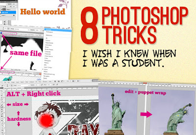
Usually to change the size of a tool, you can either use the drop-down list in the options bar, or right click in the middle of the document that will open a pop-up. But did you know that you could change the size of the tool you are working with, in a far more precise way by only using your mouse and the ALT key?


The technique is pretty simple. FIRST hold ALT key and THEN right click on the mouse, you then will see a red circle appear. This is the current tool size. Move your mouse to the right: the size of the tool gets bigger, move it to the left: the tool gets smaller.

Bonus point: If you move it to the top and the tool hardness will decrease, move it to the bottom, and the tool hardness will increase. This trick works with all the tools that can get a specific size and hardness.


-3- Take Advantage of Multiple Windows

If you go and take a look in the windows menu, you will see under 'Arrange' the option "new windows for ZZZ". This option will duplicate your current document in a new window. The nice part about this is that changes will affect both windows, it is basically just a second view of the same document.

Then you’ll ask, why would I want to open the same document in two windows? I’ll give you two examples for using this tip.

Let’s say that you are working on a document that will be both used for web AND print, you might want to have a preview of your document in CMYK right? Here comes the handy part of the trick: you can still work in an RGB environment on your document, while previewing what it will look like in CMYK. Go to window > arrange > new window for XXX. Then set the view of this document to "proof colors" (CTRL+Y).

Now you can keep on working on your document in RGB, while seeing what it would look like for the print version.


Another use would be while working with layer masks. To display a layer mask in full screen option, you just have to press ALT + click on the layer mask. You should then get a layer of black and white colors, corresponding to your layer mask. It is pretty hard to work on that layer, since you don't really see what you are doing.

Here again we could open our document on a new window, and then get side by side the layer mask preview and our image. We could then do more precise work on the layer mask and see results on the other window.


-4- Unleash the Power of Clipping Masks

Clipping masks are very useful in complex Photoshop creations. They enable you to work, using another layer as a frame. Basically, whatever is created in a clipping mask will only affect the layer below it. We can see an example with some text.


In the example below, I created a text layer. Then I added an empty layer, and clipped it to the text. I used a brush to draw pink leaves above the text and as you can see, the brush can't go "outside" of the text layer. If I release my clipping mask, I then see that what I created was actually not cut, just hidden.

To create a clipping mask above a layer, you just have to hold down the ALT key while clicking on the create new layer icon. Then the new layer dial box appears, and you can just check "Use previous layer to create clipping mask". You can also achieve this with the keys shift + CTRL + N.


-5- Easily Create a Selection from a Layer or Mask

By clicking on the thumbnail of a layer and holding down the CTRL key, you will create a selection based on the layer clicked. Once again this can be very useful to select text for example, but also complex shapes.


The great thing about this trick is that it will work on layers, but also on masks. You can for example select the shape of a vector mask.


-6- Puppet Warp Transform

To transform an image using puppet warp transform, simply click on edit > puppet warp. The image will be then scattered with a mosaic of lines. At the junction of each line, you can place a pin. You will need at least two pins on the image.

The active pin is symbolized by a yellow disc with a second black one, inactive pins are simply yellow discs. With puppet warp you can move a part of the image while the other parts don’t move. Just pin the parts of the image you don't want to move, and play with the other ones.

Here is an example of what can be achieved, let's make the Statue of Liberty dance:


Image credit: Mr G's Travels
You can delete a pin by holding ALT and hovering over the pin with the mouse, you can also get a rotating circle around the active pin with this same ALT key.


-7- Use the « Styles » to Save Useful Effect Presets

Another Illustrator feature I really like is the "graphic styles" panel which enables you to save any element style you create. This is particularly useful when you do a lot of GUI design, lots of buttons and you want to be able to re-use a graphical style you created. This feature is also possible in Photoshop.

Once you are finished playing with your drop shadow, inner shadows, etc. options, you can see that there is a tab at the top of the layer style named “styles”. You might never have noticed that, but you can click on it. Then you can simply click on the "New style" button, and save your style.


Another way would be to select the layer that has the style you want to save, open the style panel on the right (you might have to activate it in “view”) and click the little “new” icon (same icon as new layer in fact), then save it.

In this panel, you can also see all the other styles that were saved (or default Photoshop ugly styles). To apply a style to an element, first select the layer. Then you have got two solutions:
  • Select the style you want to apply from the styles panel.
  • Use the option bar drop down style list. For this option to appear, the rectangle Tool (U) must be your active tool.
Another cool feature about styles is the ability to save, share and load them, so that you can create a complete library of styles. In order to export styles, open the styles panel and click on the top right down-pointing arrow, to open the presets manager.

From there you can save your styles. By default none is selected, and you will have to select all the styles you want to save. You can use the same panel to load some other saved styles libraries.


-8- Don't Cancel Adjustments, Reset Them

Curves and level adjustments can be hard to master, especially at the beginning. Sometimes some level combination or other adjustments just don't fit quite well in the design, and the designer has to start over. The common way to do that would be to press the cancel button, and re-open the adjustment box we were working with.


But there's a little trick that helps win some time here: when you want to cancel a curve, instead of directly clicking on the cancel button, hold the ALT key. The cancel button disappears, and is replaced by a reset button.

Clicking on the reset button will, well, reset the curve (or any adjustments you were working on) and you can start all over again.


- Conclusion -

As you can see, there are plenty of things we can easily achieve with Photoshop. I hope you enjoyed these 8 little tricks. If you have more tricks, don't hesitate to share them in the comments below!

Thursday, November 10, 2011

dribbble & such

While reading an article about the difference between art and design (as it relates to websites) I followed a separate link and found more than I was bargaining for. What started as a reading exercise quickly became much more. Dribbble what? Enter the writer's philosophical standpoint on art vs. design (the age-old argument). I'll recap some highlights but click here for the entire article.

Dribbble in 24 Seconds

I find it hard to believe that any designer that’s even slightly in touch with the design community hasn’t heard of Dribbble yet. But in case you haven’t, let me quickly fill you in.

Dribbble, in its simplest form, is a community site designed to give creatives a platform for showing a small snapshot (400×300 pixels or less to be precise) of designs they’re currently working on.

Rather than upload a snapshot of a finished design or uploading snapshots solely meant for the Dribbble community, the creators of the site intended Dribbble to be used as a sort of "Twitter for creatives" — a feed of what they’re doing right now.

Content on Dribbble is uploaded by players in these three forms:
  1. Shot: When a player uploads an image of 400x300px or smaller for people to view, comment or mark as a favorite
  2. Rebound: When a player takes a previous shot (either their own or another) and changes that image in a way they feel enhances the original
  3. Competition: Usually seen as rebounds, a competition will have a design brief steering the designer towards creating a specific image

How Dribbble Is Being Used By Some

The problem I’m seeing on Dribbble is that the design work I often encounter isn’t design at all; they’re art.
People will have their own list of differences between art and design. For me, the difference is simply one of purpose.

Art may often lack a function; it may be created for no other purpose than to look good or to provoke emotions. Thus, art can often prioritize form (aesthetics) over function.

Design, on the other hand, must work functionally to suit a myriad of purposes. A design is meant to be used by those who encounter it; whether it’s in the innovative design of a laptop or as a way to attain information.

Are most images being uploaded to Dribbble design or art? From what I see, many of the shots fall under the latter category.

Even worse, many snapshots are being created simply to be uploaded for admiration on Dribbble.

Why are some players creating designs that will never be used or seen outside of Dribbble? Much of it appears to be a game of vanity and competition. Rather than spend time creating work within the constraints of a client brief, some designers feel they can create their best work without real-world constraints and in a timeframe that allows them to create something simply for the purposes of eye candy. Some designers seem only concerned with showing off their skills in idealistic forms. Most of the work appearing on Dribbble is generally fantastic and wonderful to look at, but so are many art pieces in an art gallery.

As I mentioned earlier, I use Dribbble as a source of inspiration. I’m willing to bet many other designers do as well. With so much art being uploaded to Dribbble, coupled with its ubiquity and authoritative standing in the industry, it’s easy to see that it can have an influence on the direction of Design.

The web design industry, in particular, has reached a point where we’re capable of creating such complexity in our work that the edges between Art and Design can easily be blurred if we choose to do so.

With only milliseconds to make an impression, we’re also under constant pressure to produce visually impressive websites to capture the attention of visitors. But is this shift towards form over function good for Design and its users? Are site performance, usability, functionality and purpose being sacrificed over artistic and subjective choices?

This is an issue I’m having to deal with in my own work, and luckily clients are there to keep me grounded. But Dribbble is making it difficult for me not be tempted to jump on the bandwagon of form over function; work that you couldn’t possibly recreate within real-world industry best practices, deadlines, budgets, and demands.

So rather than take from Dribbble the ideas that provide unique solutions to design problems, some designers are instead absorbing the aesthetic beauty and complexity of the designs being posted, instead of remarking on the function and purpose of the design. A quick look at comments on popular snapshots on Dribbble will show you that the discussions are around aesthetics and not about design.

I think the situation affects new designers the most; those not yet experienced with the demands of real projects. They can see the snapshots being uploaded on the site as being reflective of what their peers are doing right now and assume that’s what Design is. They may mistake work being presented on the site as an indication of the work they should be producing.


It’s Not Dribbble’s Fault

It’s not the fault of the fine creators of Dribbble; they created a site that could facilitate the purpose they set out: To provide a social platform that allows designers and creatives to share "small screenshots of the designs and applications they are working on."

Instead, it’s down to the players to use the site under the spirit in which it was created for.

[source: Kean Richmond is a full-time web designer and developer based in Yorkshire, UK. Working as a generalist in most areas of web design and development he currently works at Bronco, tweets as @keanrichmond and rants on his personal blog.]